Plot operations
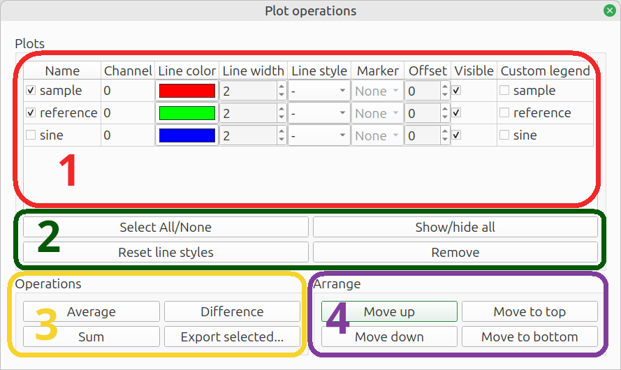
The plot operations menu contains the list of plots. This menu offers the options to change the line style, apply mathematical operations, reorder the plots or export the data. Depending on the number of plots selected, some buttons can be disabled.
- Plot list
- Select & remove
- Operations
- Arrange

Plot list
This area lists all plots within the figure.
- Checkbox: a plot is selected when this checkbox is ticked; the selection is used at the buttons at
Select & remove,OperationsandArrange - Name: for your own reference
- Channel: lists
Auto power channelor (TF input,TF output) for power spectra - Line color: click the color to change
- Line width: light (1) to heavy (8)
- Line style: solid, dashed, dash-dot, dotted
- Marker: diamond, triangle etc. - not always available
- Offset: vertical offset applied to plot; to make overlapping plots visible or to move widely spaced plots together
- Visible: show / hide 10: Custom legend: tick the checkbox to modify the legend label

Select & remove
These buttons can quickly select or hide all plots, reset the line styles or remove one or more plots.
- Select All/None: select all or no plots
- Show/hide all: hide or show all plots
- Reset line styles: reset the
line color,line width,line styleandmarkerto the default cycler - Remove: delete selected plots. Plots can also be deleted by pressing the
Delkey on the keyboard.

Operations
These operations apply to the selected plots.
- Average: calculate the power average and plot the result in the same figure
- Difference: calculate the difference - y values are simply subtracted, without any conversion to power
- Sum: calculate the sum, with the option to weigh each differently and a choice between summing power or decibels
- Export: export processed data - it first opens a settings window

Export
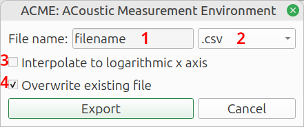
The Export operation opens a settings popup:

- File name:
Name of the target file, without extension - File type:
File format:Comma Separated Values(.csv),Spreadsheet(.xlsx) orNumpy array(.npz) - Interpolate to logarithmic x axis:
Interpolate to 200 logarithmically spaced frequencies between 1 Hz and the Nyquist frequency. This reduces the file size and makes spreadsheets more manageable. If the option is not checked, the raw data is exported. It usually has a linear frequency axis. The frequency step size equal to the sample rate, divided by theFFT lengthat which the plot was generated. - Overwrite existing file:
Do not give a warning if the target file already exists.
When finished, click Export to export the data.
Arrange
Move the selected plots up or down in the list. Multiple plots can be moved simultaneously.
